
Prop Tech & Real Estate
Role:
UX/UI Design
Client:
Neutrolabs
Duration:
7 Weeks
With an existing app in place, my focus was to understand the challenges users face when investing online, especially in real estate. Also, identify the frustrations they experience with similar platforms, and ensure consistency across the product.
Research Insights
Users feel unsure about the legitimacy of investment platforms.
Users want intuitive navigation, transparent information, and clear investment steps.
The Challenge
Connecting Insights to Action

Scope Definition
Using insights from user interviews, I identified key pain points and goals, mapping them in a diagram to align user needs, business objectives, and technical constraints. This process clarified priorities and provided a roadmap for the design direction.

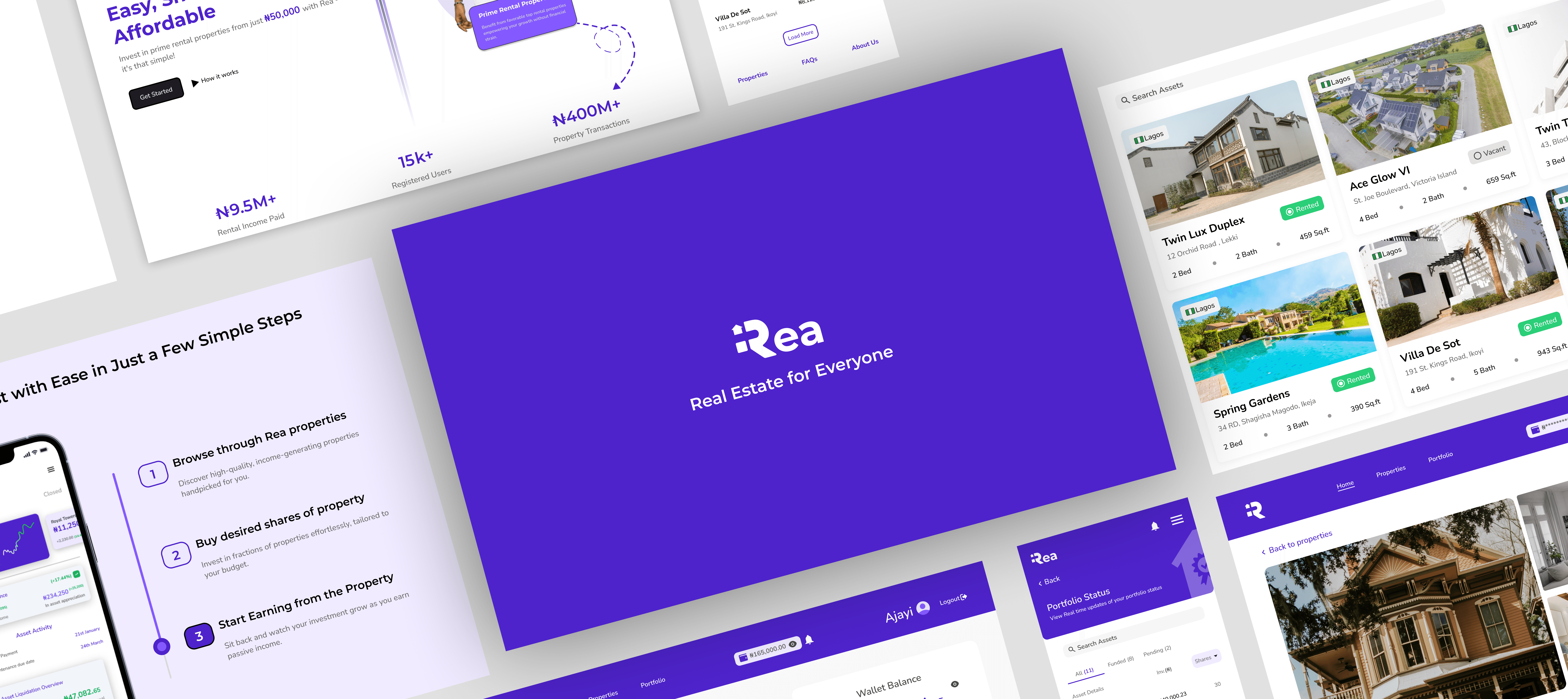
Homepage as a Gateway
I began with wireframes of the homepage, focusing on creating a compelling landing page that communicates trust, simplicity, and the platform’s value proposition. This set the tone for subsequent pages.
Visual Identity


1.
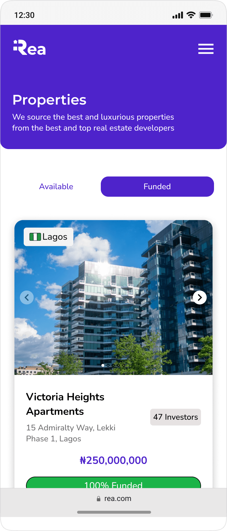
I aimed to create a design that allowed users to explore the entire page effortlessly, eliminating guesswork. The interface enables users to view available properties and their current status, striking a balance between user needs and Rea’s commitment to trust and transparency.
2.
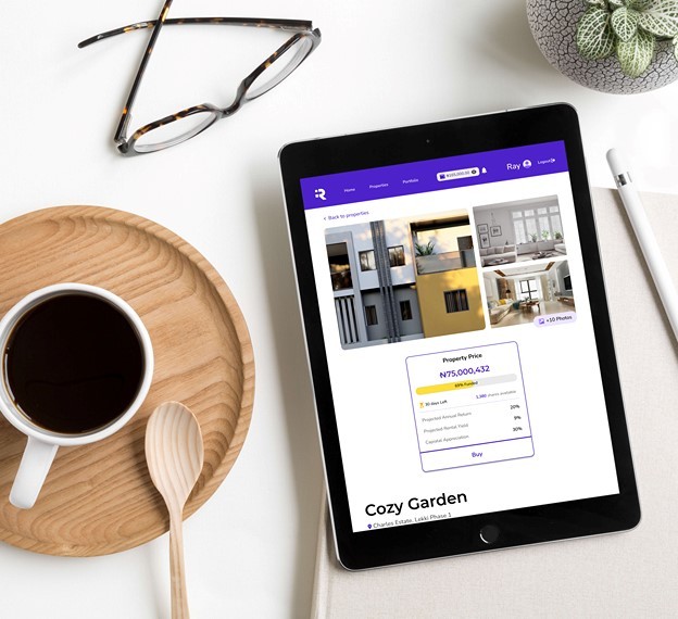
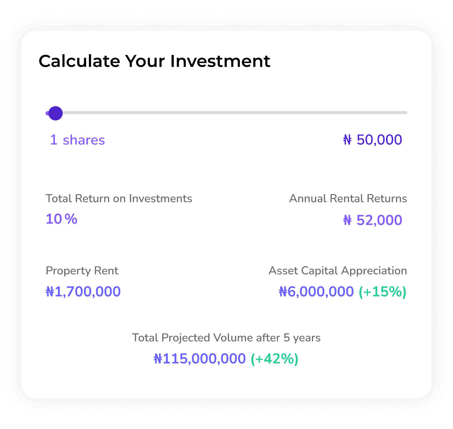
To ensure a seamless experience, users can access property information for the type of property they’re interested in. Features include property name and address, status, and an investment calculator to provide projected estimates on investments


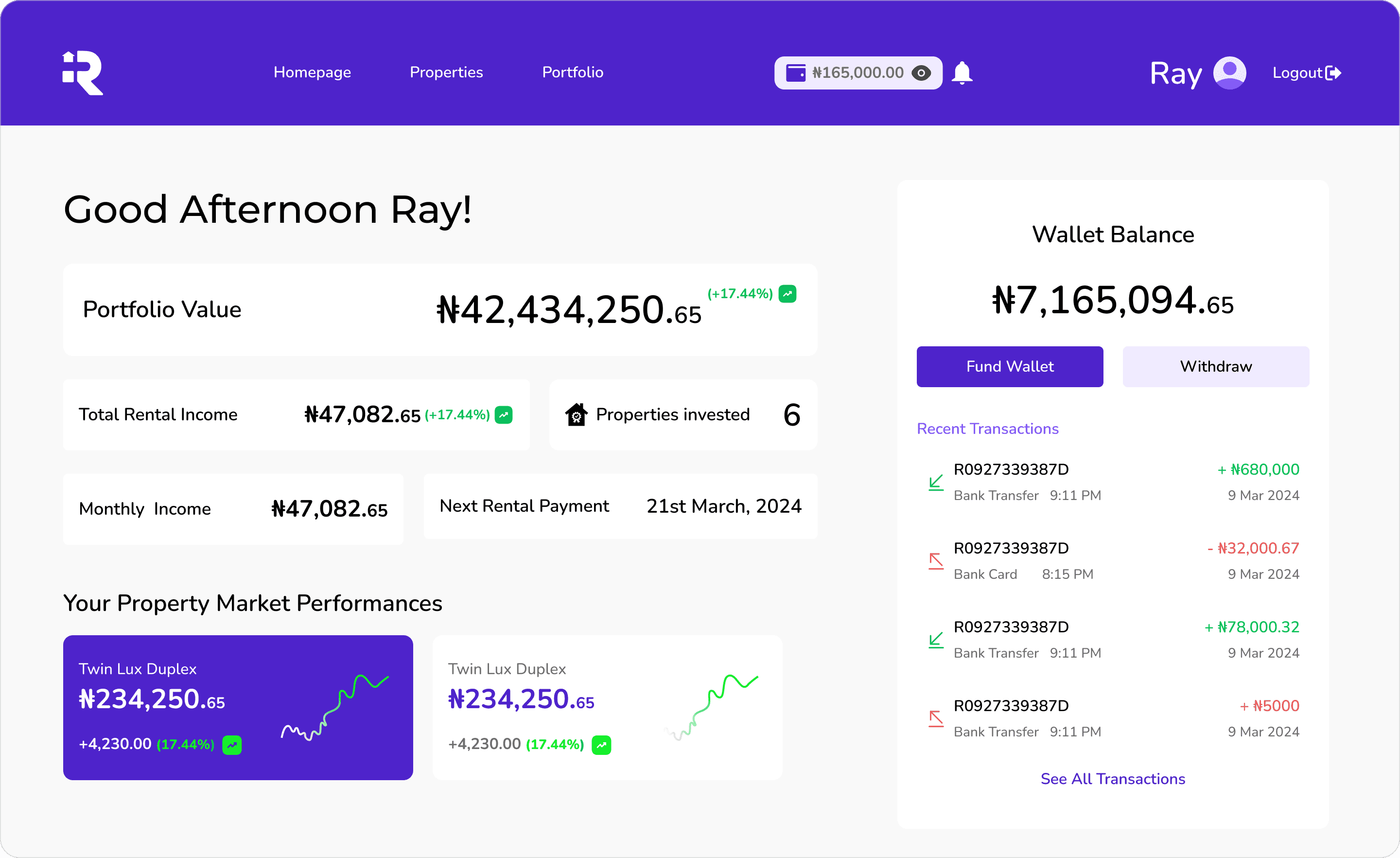
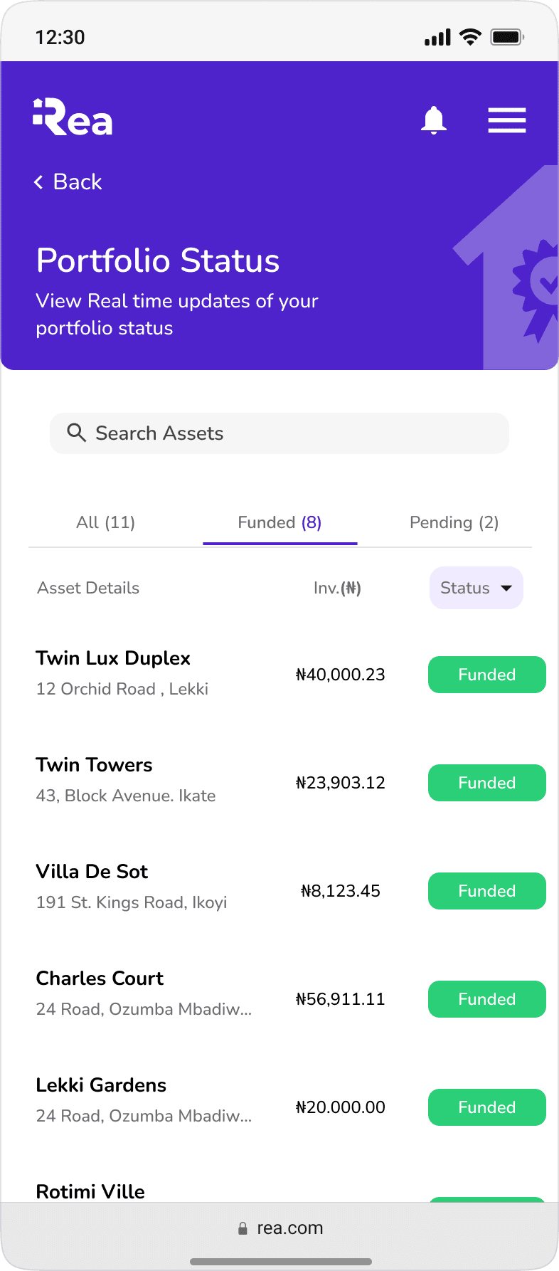
Centralizing Investment Activities with the Dashboard

A/B Testing Insights
After designing two dashboard concepts, I conducted A/B testing with 10 participants to understand which version resonated more with users and to evaluate the effectiveness of each approach.
The Results

Users appreciated the UI layout and overall experience but desired more visual clarity.
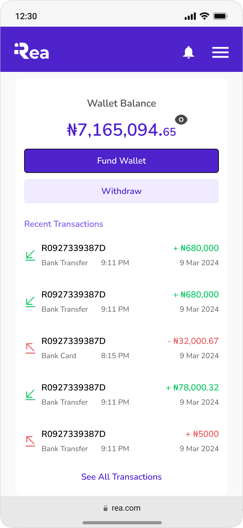
Liked the visibility of wallet balance alongside their portfolio.

Appreciated the visibility of wallet balance alongside their portfolio.
Users found the property performance UI unclear and struggled to access details about upcoming rental income payments and their total property investments.
Refined Dashboard for Optimal User Experience


Ensuring a Responsive Design

Adapting for Mobile
Optimizing the web app for mobile screen sizes presented challenges, as some desktop components didn’t translate seamlessly to smaller screens. I reimagined layouts for mobile without sacrificing functionality.
Limitations and Learnings
Limitations
Time constraints limited user testing. Ideally, I would have recruited more participants for comprehensive feedback. However, I look forward to gathering insights post-launch.

Learnings
Designing a responsive web app requires adaptive thinking beyond traditional breakpoints, emphasizing flexibility, close collaboration with developers, and leveraging existing design systems for consistency and efficiency
Next Project

