ChatGPT
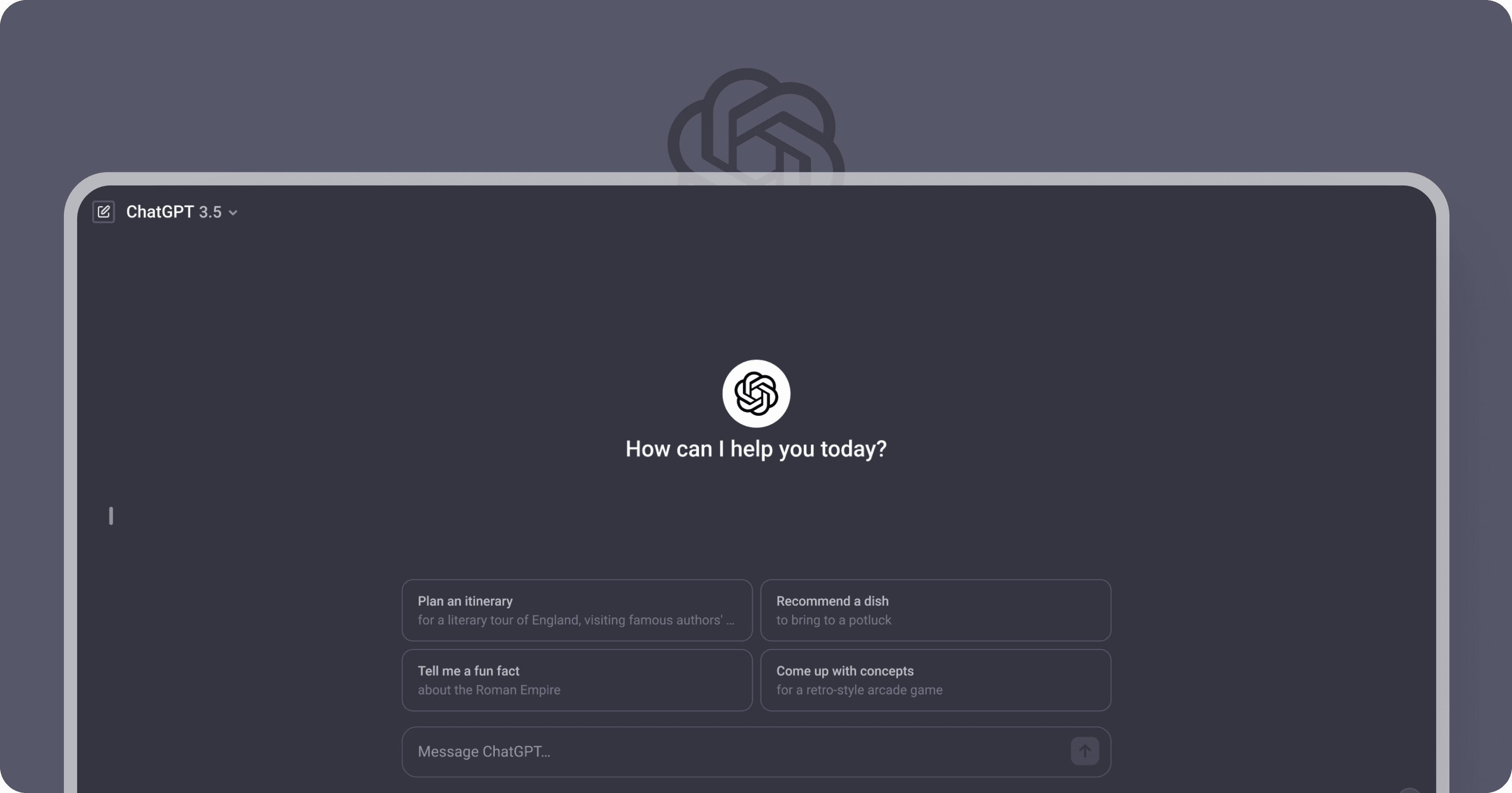
Over the past year, my experience with OpenAI's ChatGPT has been exceptional. The platform’s swift responses and versatile capabilities make it a standout in the world of conversational AI. However, while ChatGPT excels at delivering high-quality information, I noticed areas in its user interface (UI) that could be optimized to improve the overall user experience. This case study explores these usability issues and details proposed design solutions aimed at enhancing user engagement and ease of navigation.
UX Design
Personal Project
Jan 2024
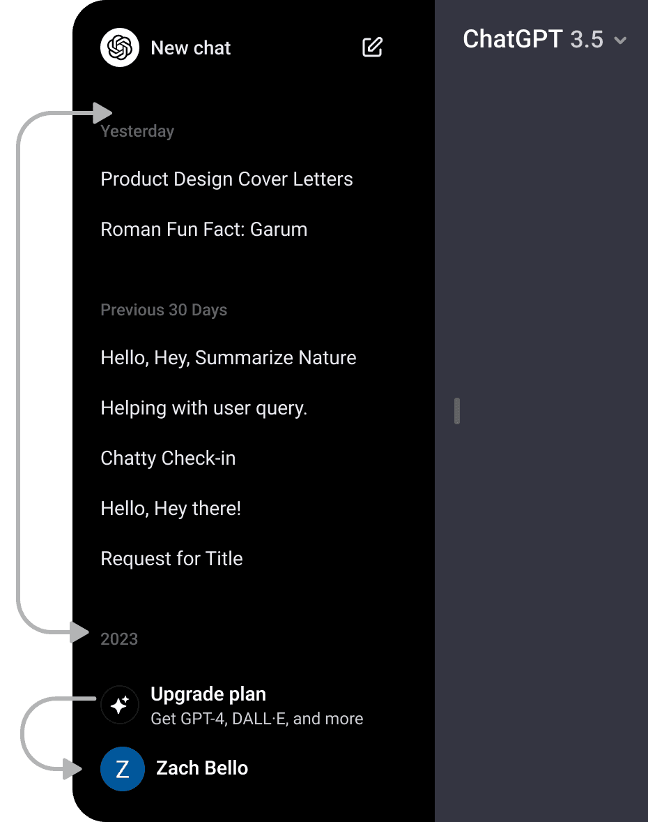
ChatGPT has revolutionized user interactions with its robust natural language processing capabilities, amassing over 100 million users. However, in my usage, I observed specific challenges in navigating past conversations, which often led to inaccurate suggestions and user frustration. These issues pointed to a lack of quick access to prior prompts and a need for more user-friendly navigation.
Key Problems Identified:
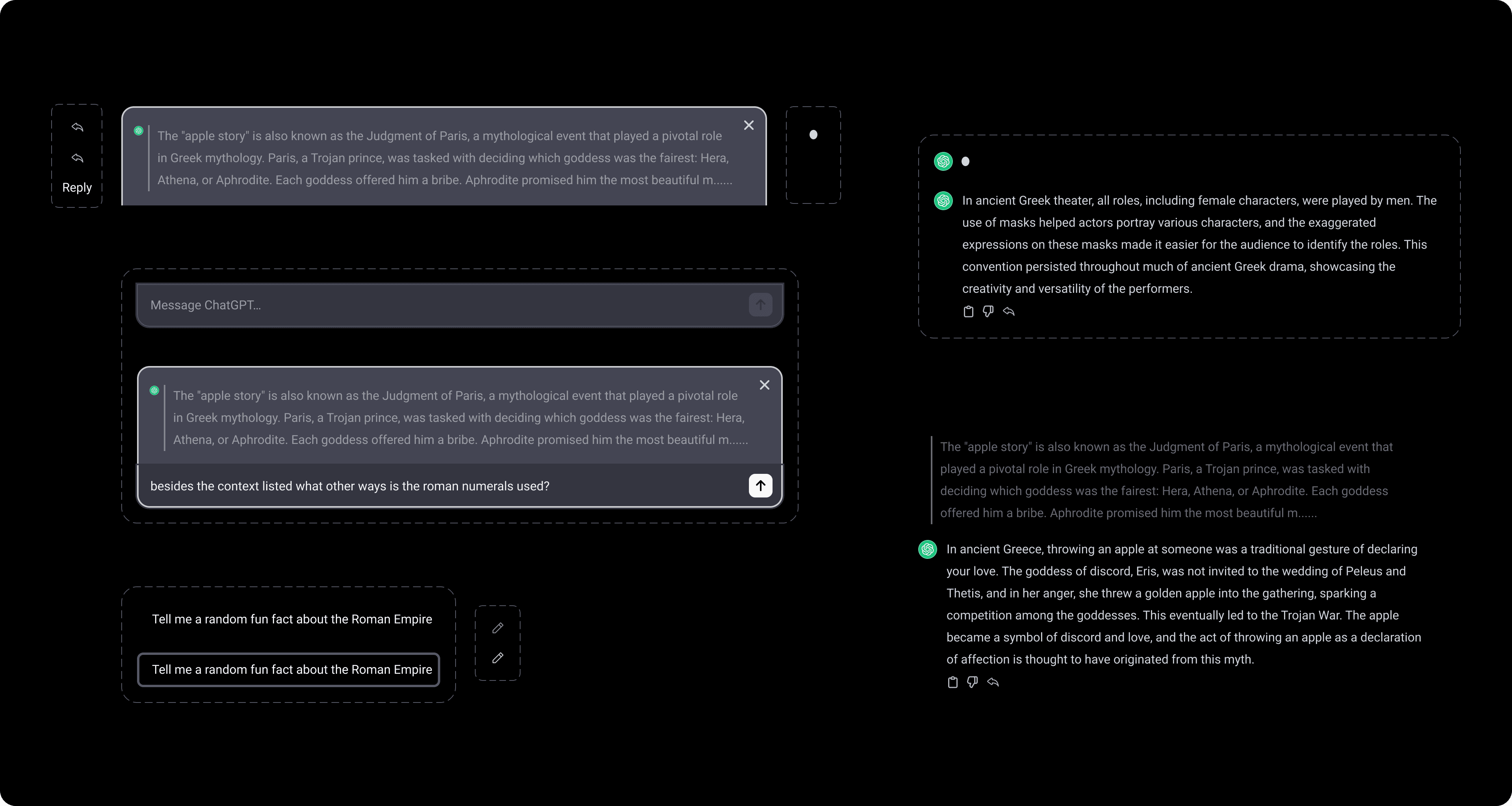
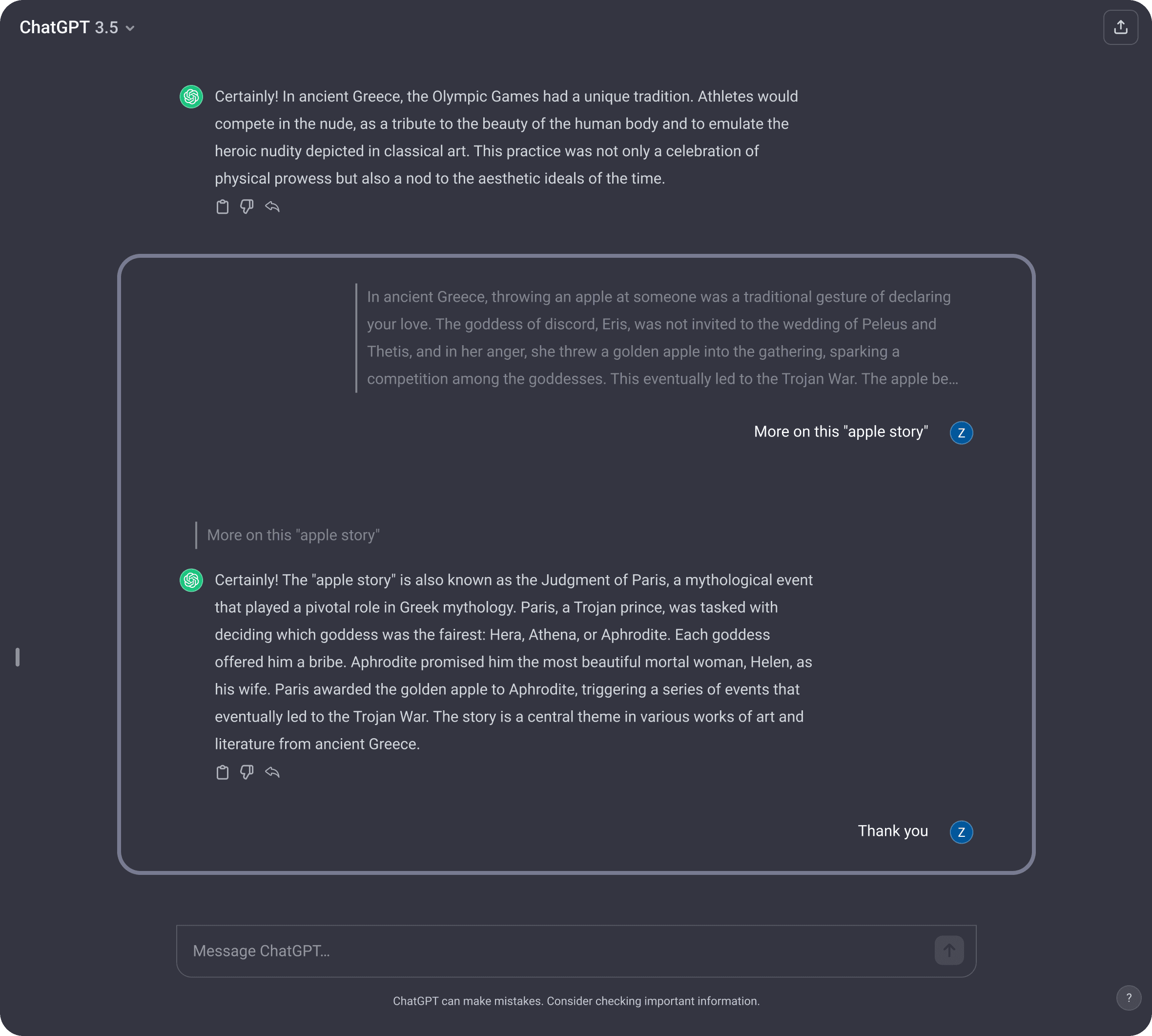
Difficulty Accessing Previous Answers Without Re-entering Prompts
Lack of Editing Indicators
Lack of Search Button for Chat Navigation.
Cognitive Overload from Excessive Chat History
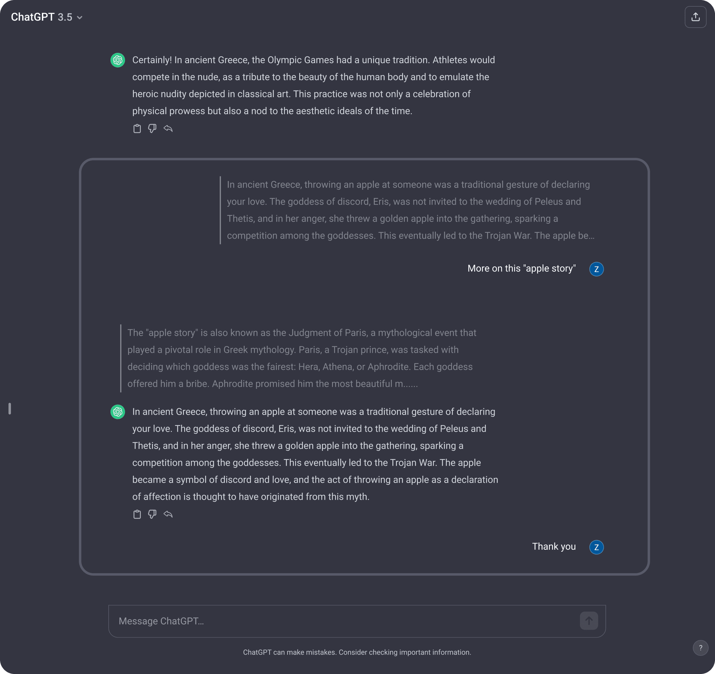
Implement a button allowing users to reply to a specific response, enhancing interaction continuity.
Refine the UI to improve the flow of conversation for a seamless user experience.
Introduce a search button to streamline navigation and support efficient recall of past conversations.
Simplify chat history display to reduce cognitive load and enhance readability.
Introduce a visual highlight for prompt editing to better indicate active user actions.
My redesign approach focused on usability improvements while maintaining consistency with ChatGPT's established design style. Following Jakob’s Law—which suggests that users prefer familiar patterns—I sought to incorporate recognizable UI elements seen in popular messaging apps like WhatsApp, Instagram, and Messenger, leveraging their well-established interaction patterns. Inspired by these platforms, I designed a “reply” feature that users would immediately recognize, reducing the learning curve.
Refined Sidebar Navigation
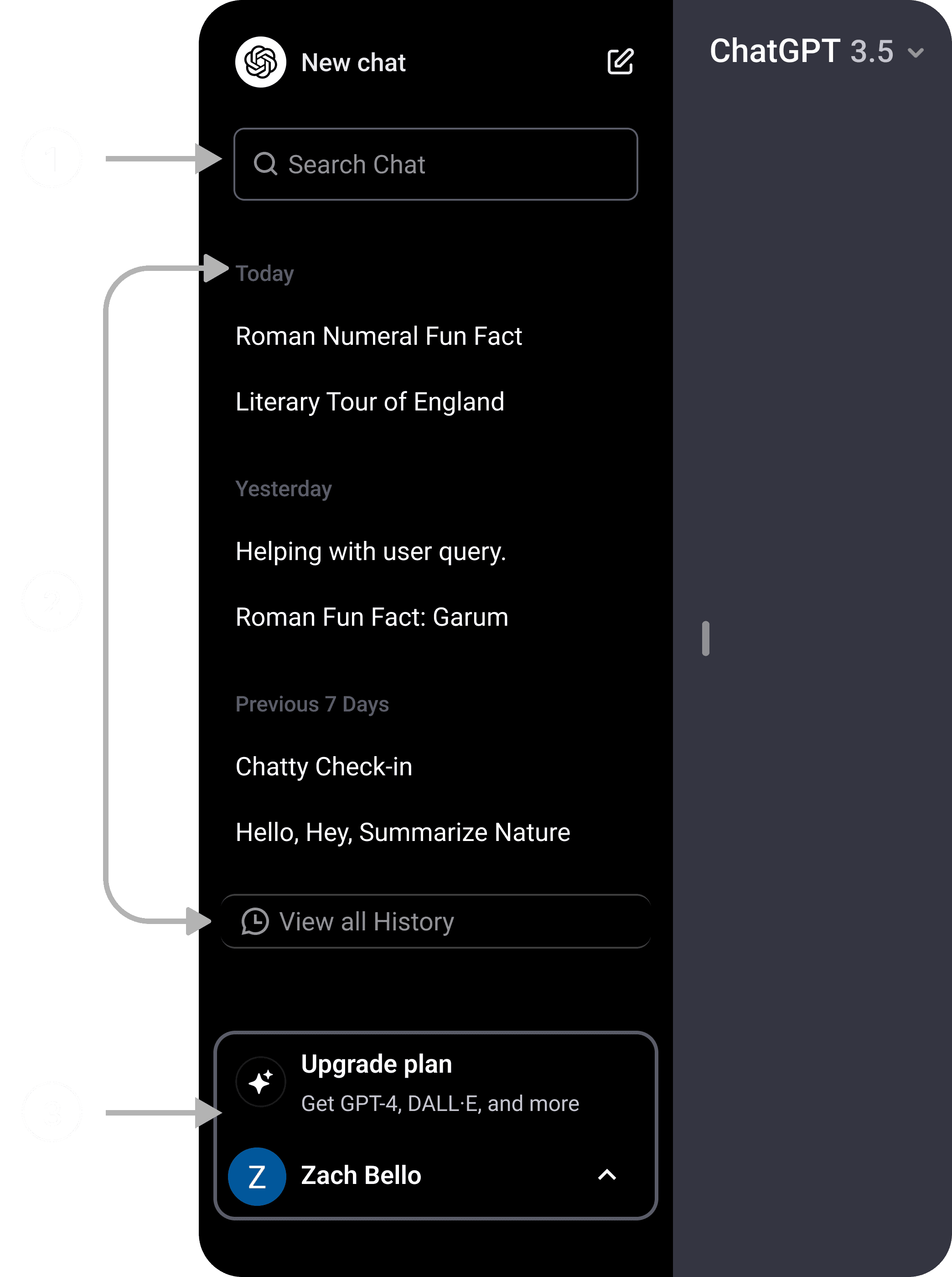
Added a search button for streamlined navigation.
Limited history categories to 3 categories: "Today," "Yesterday," and the past 7 days, with an option to view all history.
Highlighted the profile section for improved visual hierarchy.
To confirm the effectiveness of the redesign, I conducted a second round of usability testing, focusing on the final implemented features. Results showed that 80% of users felt more engaged with the interface, particularly praising the message reply and editing highlights.
This project reinforced the value of simplicity and familiarity in design. Seemingly minor UI and UX adjustments—such as clearer navigation, reply functionality, and editing highlights—substantially enhanced the overall user experience. By focusing on issues that might appear minimal but are impactful, I created a solution that addresses both functional and aesthetic needs.
One challenge was prototyping these features within a live, AI-driven environment while maintaining the platform's existing structure. Simulating a live AI experience required carefully managed constraints, and I focused on clear communication of design intentions to ensure a smooth, consistent experience.
I’m hopeful that ChatGPT may implement similar features to improve user engagement. Overall, this was a rewarding experience, illustrating how careful attention to design details can lead to meaningful improvements in digital interactions.